

This is one of two mockups featuring the Cotton Candy flavor.

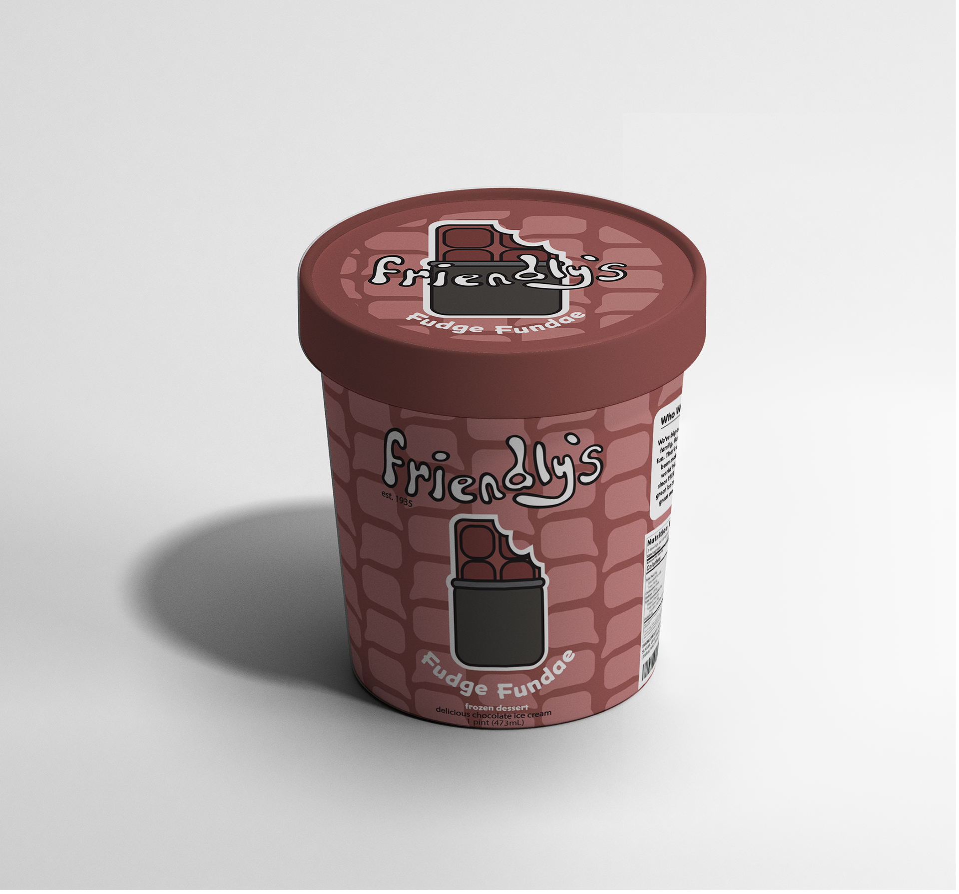
This is one of two mockups featuring the Chocolate flavor.

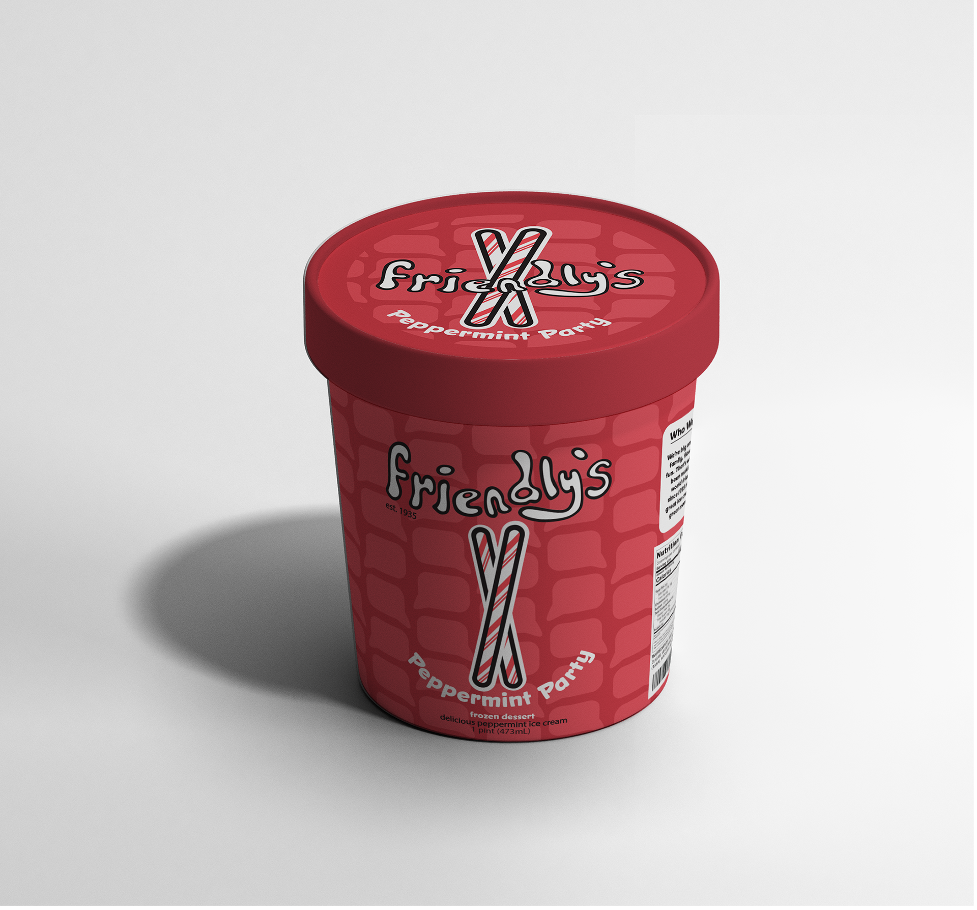
This is one of two mockups featuring the Peppermint flavor.


This is the logo in a plain black, inverted, and stroked format.

This is the base pattern for the Cotton Candy packaging.

This is the base pattern for the Chocolate packaging.

This is the base pattern for the Peppermint packaging.
This project is a revamp to the classic Friendly's Ice Cream brand. This redesign is aimed at the
18–24 age bracket and women specifically.
18–24 age bracket and women specifically.
Below is a brief on Friendly's brand, researching the history of the company and how the designer
would approach the redesign.
would approach the redesign.
Brief: Friendly’s
Friendly’s began as a company in 1935 as an ice cream store and has since grown into restaurant franchising and retail sales of ice cream and related dessert products. This company has always been invested in promoting ‘friendliness’ and the creation of memories with loved ones. Recently, the company has come into some financial hardship (after its bankruptcy and following the sale in late 2020), and so this rebrand will help to revitalize the image of Friendly’s and offer a fresh start.
Project objectives include a rebranding and restyling of Friendly’s ice-cream products and their goals and target market. This rebrand will include a revised logo, color palette, product packaging, and updated flavors for a contemporary market. Specifically, this new product line will market towards the college-age demographic (approximately 18-24). With such a long history, Friendly’s needs a combination of tradition and modernization to bring relatively young consumers back to the brand.
The scope of this project will include the aforementioned assets: logo, palette, packaging, and flavor choices. The logo will be available in full color (Pantone and CMYK) and black/white. Deliverables will include packaged InDesign files as well as PDFs and PNG files of the finalized products.
The design process will include extensive research into demographics, target markets, color theory, and the current imagery related to Friendly’s. This will allow for a clean transition to an updated brand image. The client will receive three rounds of feedback for revision (a combination of feedback on color, logo, package design, etc.), and will also receive three logos for consideration before the work is finalized. All work will be finalized and delivered by Wednesday, February 22nd, 2023, at 3:00 PM.
A key element of success will be in maintaining an element of “friendliness” in the updated brand imagery so that the new products can remain consistent with the company’s ideals and goals.